My Happy Tank Website Audit
Client: My Happy Tank
Website: https://myhappytank.com
Assignment: Website audit focused on the User Experience
Designer: Phuong Lee
Brief
My Happy Tank, established in 2023, is a brand of toilet bowl cleaners dedicated to providing high-quality cleaning solutions. Despite being a new player in the market, My Happy Tank aims to stand out with its effective and environmentally friendly products. However, the client was not satisfied with the quality of its website. As a company with limited resources, the marketing team wanted to refresh their website to attract new customers and retain their existing ones.
To understand the website’s overall user experience, they asked me to investigate its baseline and provide practical advice for improvement. We agreed that I would compile my assessment into an audit report, including detailed feedback and actionable recommendations. I would then present this report in a digital meeting.
1. collecting information
Business goals
During one of our initial meetings, we discussed all of their primary requirements for the website. The team, consisting of two members and an assistant, provided detailed input. We agreed to focus on SEO, accessibility, and Website design review to improve the website’s performance.
I was able to define their biggest business goals related to the website:
- Strengthen Brand Recognition
- Improve SEO Performance
- User Experience while navigating the My Happy Tank website.
User goals
The website’s primary users are consumers, including household residents and businesses with toilet bowls, who seek effective cleaning solutions for their toilet maintenance needs. The secondary users include house cleaners who utilize these products in their professional services. The business relies on word-of-mouth, social media, Amazon Business to Business, and click-through rates to drive sales and build brand recognition.
I defined the goals of their primary user:
- Keep their toilet bowls clean with effective and easy-to-use products.
- Maintain a hygienic home environment.
- Save time and effort on toilet cleaning.
- Ensure cleanliness and hygiene in their facilities to meet health standards.
- Use cost-effective cleaning solutions for regular maintenance.
- Enhance the overall experience for employees and visitors.
And the goals of their secondary users:
- Reduce the time and effort required for toilet cleaning.
- Share positive experiences with the product to help friends and family.
- Promote the brand through personal recommendations.
- Social Media Influencers review and promote the product to their audience.
- Amazon customers purchase on Amazon through recommendations
Auditing the website
I conducted a thorough exploration of all the web pages, evaluating their information architecture. I tested the user flow and all the features, critically analyzing whether the users’ goals were being met. I also assessed the alignment with business goals. Any gaps between the goals and the website were noted, and I took screenshots where possible to highlight these issues for later review.
2. the assessment
Overview
Business goals and user goals were not being fulfilled. Currently, the website has not effectively converted visitors into new customers due to the incomplete setup of WooCommerce, which complicated the user experience.
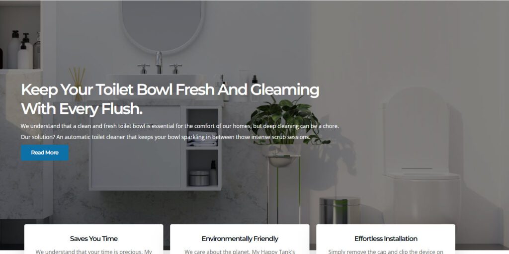
The UI, though modern, was complicated with an overwhelming hero section, which resulted in no clear message for first-time online visitors. Information was hidden and spread across too many pages, making it difficult for primary users to find what they needed.
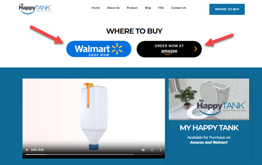
There were no features or content available on the MHT website to encourage users to engage with it. When users clicked on “Where to Buy”, the links to Walmart and Amazon did not work. Additionally, the video that starts automatically can be jarring due to its loud volume. As a result, users were left without clear information on where to purchase products and it creates a disruptive user experience.
Although My Happy Tank is a new company with significant potential and is gaining traction through grassroots efforts, particularly among friends, family, and the Vietnamese community, their website is not fully functional yet. This lack of a fully operational website is detrimental to their online presence and it does hinder their growing reputation.
Scope
I advised MHT to implement several improvements to enhance user experience and functionality on their website. Key recommendations included:
- Set Up Purchase Links: Ensure that the “Where to Buy” links to Walmart and Amazon are functional, providing a seamless path for users to purchase products.
- Adjust Font Sizes: Correct and standardize font sizes across the website to improve readability and user experience.
- Revamp Hero Section: Change the hero section background to something more visually appealing and relevant, ensuring it communicates the brand’s message to first-time visitors.
- Dynamic Tabs: Make the navigation tabs more dynamic and visually engaging, helping users easily find and access important information.
- Content Clarity: Add more detailed and clear content throughout the website to better inform users about the products and their benefits.
- Community Feature: Add a community feature where users can log in, interact, and access personal information, updates, news, and promotional opportunities. This would ease the workload of the staff and foster user connections.
These enhancements would not only improve the user experience but also support the company’s growth by making the website more functional and engaging.
3. practical examples
Homepage Review
While the main page has a clean and modern view, the font is hard to read against the background. To improve this, I recommended increasing the font size and choosing a contrasting color for better readability. Updating the hero background to a simpler, less distracting image will also help.
Enhancing MHT’s Website: Identifying Problems and Implementing Solutions
- Unreadable Font: The font is hard to read against the current background.
- Lack of Call-to-Action: There is no clear call-to-action button for users to follow.
- Static Tiles: The tiles on the homepage are not dynamic, making the user experience less engaging.
- Broken Links: Links to “Where to Buy” pages (Walmart and Amazon) are not functional.
- Limited Mobile Accessibility: The website is not optimized for mobile users, potentially limiting conversions.
- Content Title is not consistent with the body of text information.
Solutions:
- Improve Readability: Increase the font size and choose a contrasting color to enhance readability against the background.
- Update Hero Background: Simplify the hero background image to reduce distractions and make the text stand out.
- Add Call-to-Action Button: Incorporate a prominent call-to-action button, such as “Where to Buy” or “Shop Now,” to guide users toward making a purchase.
- Make Tiles Dynamic: Enhance the homepage tiles to be more dynamic and visually engaging, providing a more interactive user experience.
- Fix Broken Links: Ensure that the “Where to Buy” links to Walmart and Amazon are functional, providing a seamless purchasing path for users.
- Review the content title and the body of information in each section.
By addressing these issues with practical changes, MHT can significantly improve its website’s user experience, better meet business and user goals, and enhance overall functionality.
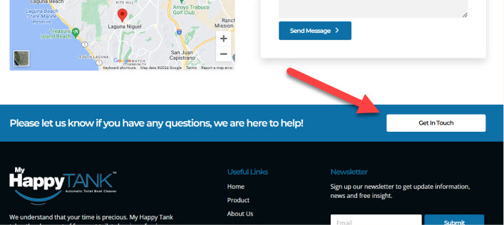
Non-Functional Contact Button
On the Contact Page, the “Get in Touch” button does not have a clear purpose and redirects users to the top of the page. To improve this, I advise removing this section since the Contact Page has the contact information already set up.
The “Buy Now” button on the homepage takes users to the product page, but the Where to Buy buttons do not go to Walmart and Amazon. To improve this, the links to Walmart and Amazon will need to be added.
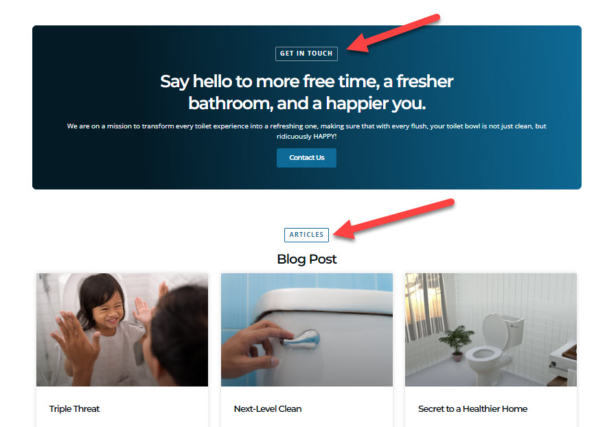
The ‘Get in Touch’ and ‘Articles’ sections are currently enclosed in boxes, which may cause users to mistakenly think they are buttons. To improve clarity and draw attention, remove the outline box and instead, increase the font size of the titles and use a contrasting color to make them stand out
4. Accessibility Review
Accessibility and User Experience Improvements
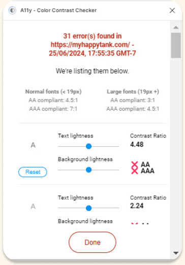
After running the MHT website through an accessibility test, 31 errors were identified that hinder its effectiveness and user experience:
- Unreadable Font: The font is hard to read against the current background.
Solution:
- Improve Readability: Increase the font size and choose a contrasting color to enhance readability against the background. This will address many of the accessibility errors found.
5. SEO review
Addressing SEO for Better Performance
After running the MHT website through an accessibility test on Website Grader, it received a score of 72%,
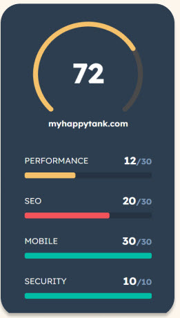
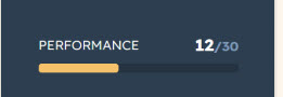
Performance score of 12/30
After running the MHT website through an accessibility test on Website Grader, it received a score of 72%, with a performance score of 12/30. Several issues were identified that hinder its effectiveness and user experience, particularly related to page speed and loading times.
Slow Page Speed: The website’s page speed is 14.6 seconds, significantly higher than the best-in-class benchmark of 5.3 seconds. Pages that load slower cause visitors to abandon the site, reducing conversions and sales.
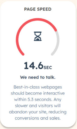
Solution:
- Reduce Page Redirects: Minimize the number of page redirects, as multiple redirects can significantly slow down the site’s loading time.
- Optimize Images: Use responsive images or SVGs to optimize for different screen sizes. Large images can take a long time to load, so optimizing them will improve overall page speed.
SEO score of 20/30
After running the MHT website through an accessibility test on Website Grader, it received a score of 72%, with an SEO score of 20/30. Several issues were identified that hinder its effectiveness and user experience, particularly related to search engine optimization (SEO).
Problem: Low SEO Score: The website’s SEO score is 12/30, indicating suboptimal search engine optimization. Improving SEO is crucial for driving organic traffic to the site.
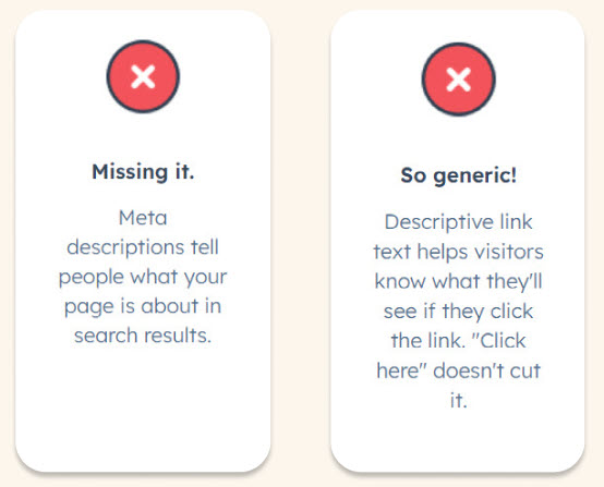
- Missing Meta Descriptions: Meta descriptions tell people what your page is about in search results. Without them, users and search engines lack crucial information.
- Generic Descriptive Link Text: Descriptive link text helps visitors know what they’ll see if they click the link. Phrases like “Click here” are not informative enough.
Solution:
- Add Meta Descriptions: Include meta descriptions for all pages to clearly describe the content and attract users in search results.
- Improve Link Text: Use descriptive link text that indicates what users will see if they click the link, such as “View our product range” instead of “Click here.”
- Install the Yoast PlugIn on MyhappyTank.com to monitor the SEO feedback.
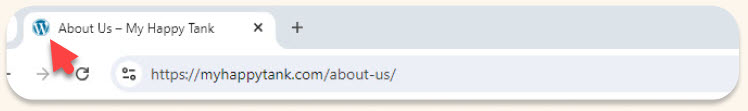
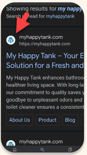
5. Logo
Missing logo
The website currently displays the WordPress logo instead of the MHT logo, which diminishes brand presence. To improve this, update the logo in WordPress to the company logo.
5. Conclusion
Conducting a website audit is a critical step for improving a website’s performance, user experience, and overall effectiveness. The case studies reviewed highlight the transformative impact of a thorough audit on different types of websites, from SEO and UX perspectives.
SEO Improvements:
- Remove unnecessary pages
- Optimizing page speed through lazy loading and image compression
- Adherence to SEO best practices can dramatically enhance search engine rankings and traffic by implementing the Yoast PlugIn on WordPress.
User Experience Enhancements:
- Analyzing user goals and business objectives helps in redesigning key elements such as the homepage and navigation structure to improve user engagement and conversion rates
- Simplifying navigation by adding clear calls to action
- Fix any broken links
Usability Optimization:
- Addressing usability issues such as overloaded homepages
- Placing a Call to Action where it is most prominent and easy for the user to click on
Content and Structural Revisions:
- Ensuring that critical information is prominently displayed and easy to access
- Reorganizing content to reduce clutter and improve focus on key actions
Implementing these recommended changes will lead to significant improvements in traffic, user satisfaction, and conversion rates, ultimately helping your website achieve its business and user goals.